Pages
You can define one or more pages in the pages key. Each page has a few high-level properties and a list of contentBlocks.
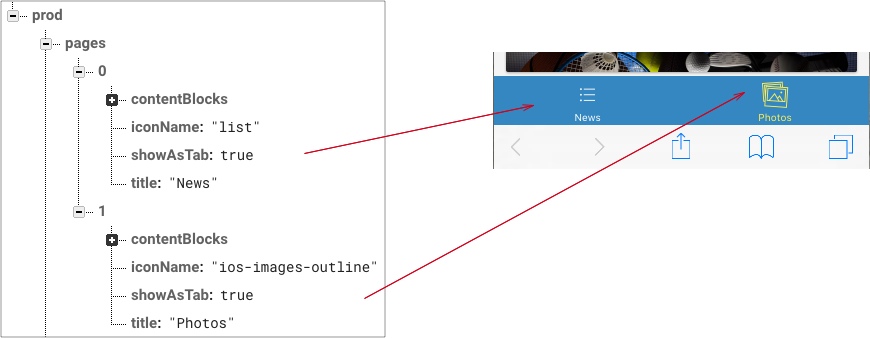
High-level page properties:
{
  contentBlocks: [], // list of blocks that define the content of the page
  iconName: "list",  // icon to be used when the page is displayed as tab (http://ionicframework.com/docs/ionicons/)
  showAsTab: true,   // when true the page will be included in the tabs, otherwise it will have a link in the side menu
  title: "News"      // title of the page, to be shown in the tabs bar or in the side menu
}
Content-blocks
Content blocks are the basic building blocks to create the content of a page. Each content block has this basic structure:
{
  component: "" // string - component name
  data: {}      // component specific data
}
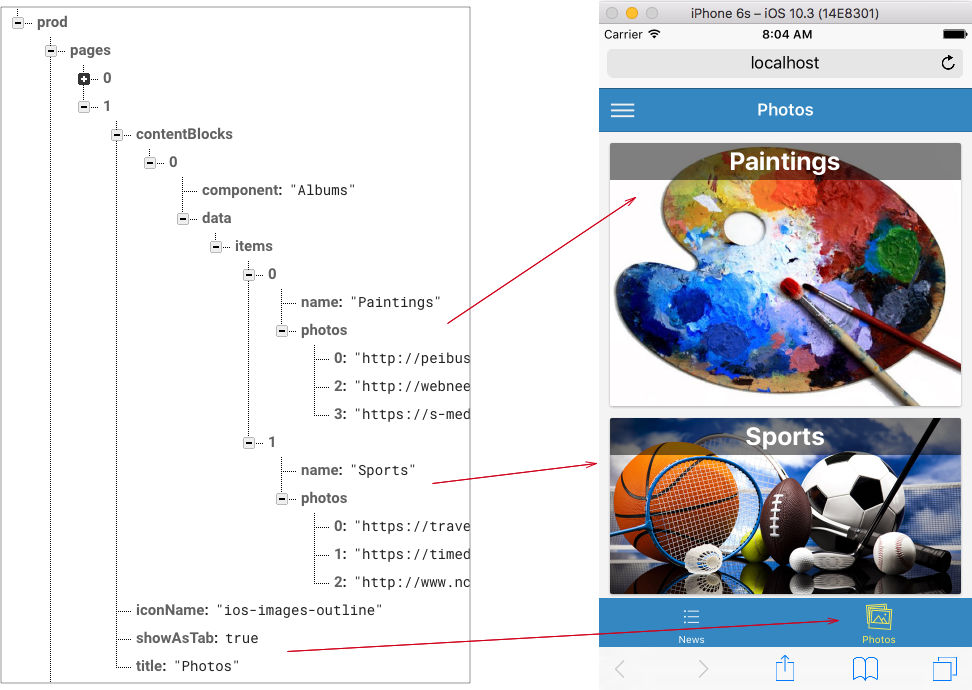
1. Albums
Albums can be used to display a list of albums. Each album will be displayed with a cover photo and a title. And each albums can contain one or more photos that the user can slide through. The first photo in the album will be used as the cover photo.
JSON structure:
{
  component: "Albums",
  data: {
    items: [ // list of albums
      {
        name: "", // string - name of the album, it will be displayed on the cover photo
        photos: [ // list of photos URLs - the first photo will be used as a cover photo for the album
          "url 1",
          "url 2",
          ...
        ]
      }
    ]
  }
}
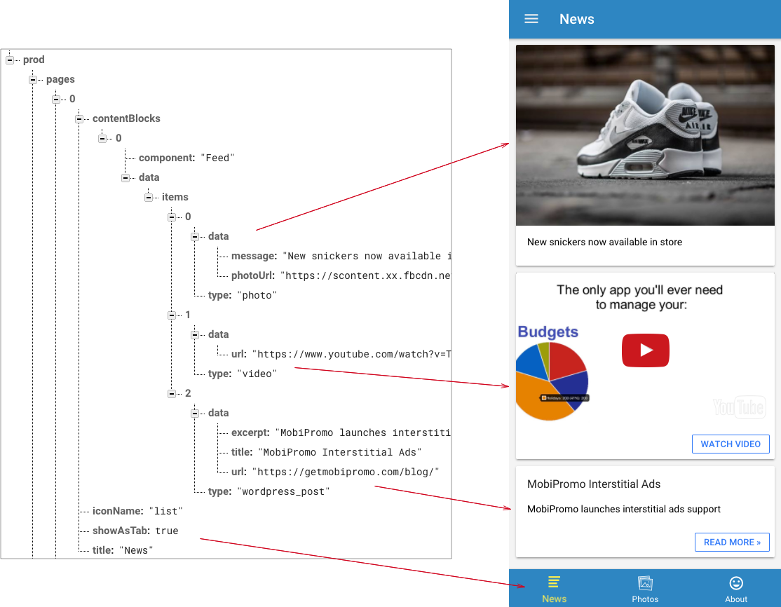
2. Feed
Feed content block can be used to display a list of posts. There are different kind of posts:
{
  component: "Feed",
  data: {
    items: [
      {
        type: "photo",
        publishedAt: "2017-06-06T13:21:29+02:00",
        data: {
          message: "New snickers now available in store",
          photoUrl: "https://PHOTO-URL",
          url: "http://LINK-TO-WEBSITE"
        }
      },
      {
        type: "video",
        data: {
          url: "http://LINK-TO-VIDEO" // full URL to YouTube/Vimeo/Facebook video
        }
      },
      {
        type: "wordpress_post",
        data: {
          title: "New blog post",
          excerpt: "short summary of the post",
          url: "http://FULL-URL-TO-WORDPRESS-POST"
        }
      }
    ]
  }
}
3. HtmlBlock
HtmlBlock can contain any valid html/Ionic tags. This is the lowest-level block, you can build anything you want using it.
{
  component: "HtmlBlock",
  data: {
    componentTemplate: "<div>Hello, world!</div>"
  }
}
